Contact
Write to Us And We Would Be Happy to Advise You.
Do you have any questions, or would you like to speak directly with a representative?
By hqt
Graphic overlays play a crucial role in capturing the attention of users and conveying important information. The design of graphic overlays involves the strategic use of text, color, and pattern to create visually appealing and informative interfaces. In this article, we will explore the various aspects of designing graphic overlays, including the impact of text, color, and pattern on user experience. Whether you’re a designer looking to enhance your skills or a business owner seeking to create engaging interfaces, understanding the principles behind the design of graphic overlays is essential.
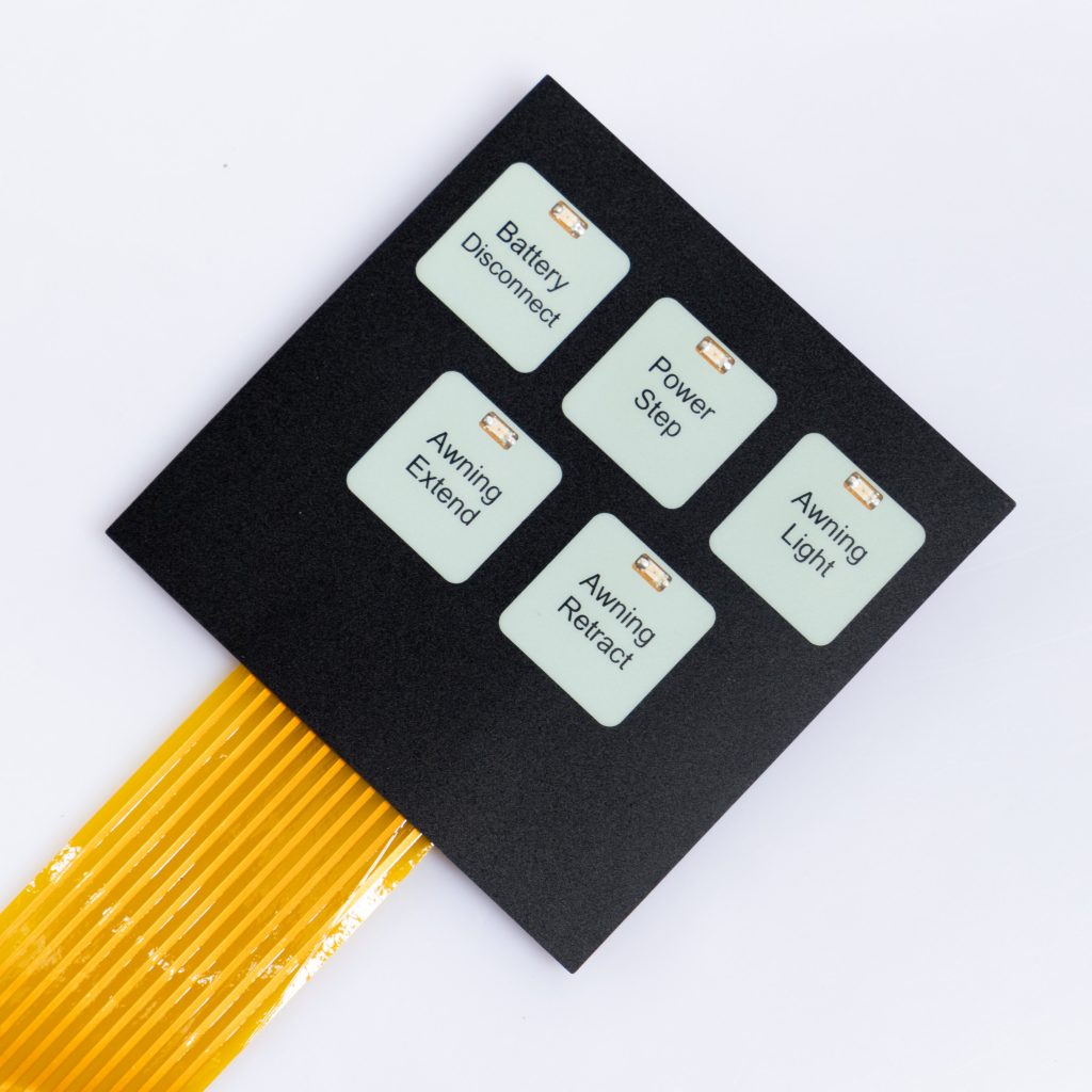
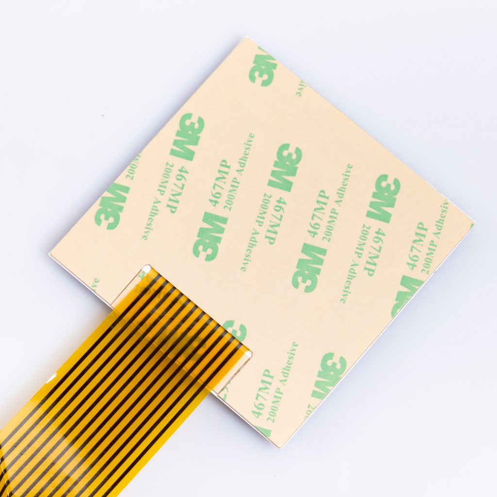
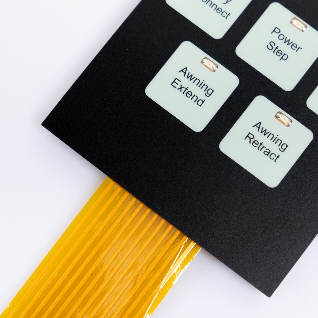
Before delving into the intricacies of designing graphic overlays, it’s important to recognize their significance. Graphic overlays serve as the visual layer that enables users to interact with a product or interface. They provide essential information, guide users through processes, and enhance the overall user experience. A well-designed graphic overlay can create a memorable and user-friendly interface, leading to increased customer satisfaction and improved brand perception.
When it comes to designing graphic overlays, the text is a fundamental element. The words used should be carefully chosen to convey the intended message clearly and concisely. The text should align with the overall design aesthetic and evoke the desired emotions in users. By selecting the right typography, font size, and formatting, designers can effectively communicate information and enhance the visual appeal of the interface.
The choice of typography plays a vital role in the design of graphic overlays. Different typefaces have distinct personalities and evoke various emotions. Serif fonts, such as Times New Roman, often convey a sense of tradition and professionalism, while sans-serif fonts like Helvetica are associated with modernity and simplicity. When selecting a typeface, consider the target audience and the overall tone of the design. Experimenting with various fonts can help find the perfect fit for the desired user experience.
Font size is an essential aspect of text design. Proper hierarchy ensures that important information stands out and is easily scannable. The headline should be larger and more prominent than the supporting text, guiding users’ attention to the key message. Additionally, designers must consider the legibility of the text across different devices and screen sizes, ensuring a seamless experience for all users.
Colors have a profound impact on human psychology and can evoke specific emotions and associations. Understanding the psychology of color is crucial when designing graphic overlays. By carefully selecting color palettes, designers can create interfaces that resonate with users and align with the brand’s identity. Let’s explore the meanings associated with different colors:
Creating a harmonious color palette is essential in the design of graphic overlays. Harmonious colors work together seamlessly, creating a visually pleasing experience for users. On the other hand, contrasting colors can be used strategically to highlight important elements and create visual interest. Designers must strike a balance between harmony and contrast to achieve a cohesive and impactful design.
Inclusive design considers the needs of all users, including those with visual impairments or color blindness. It’s crucial to ensure that the color choices in graphic overlays provide sufficient contrast and legibility. Tools such as color contrast checkers can help designers evaluate the accessibility of their color combinations and make necessary adjustments to enhance usability.
Patterns can add a layer of visual interest and enhance the overall aesthetics of graphic overlays. They can be used to create texture, separate sections, or simply add a decorative element. Patterns can be subtle or bold, depending on the design requirements and brand identity. When incorporating patterns, it’s important to strike a balance between visual appeal and usability, ensuring that the patterns do not distract or overwhelm users.
Maintaining a cohesive and consistent design is crucial in the use of patterns. Consistency in pattern design helps create a unified visual language throughout the interface, enhancing usability and user experience. Patterns should complement the overall design aesthetic and align with the brand’s identity. By using patterns strategically, designers can guide users’ attention, create visual hierarchy, and reinforce the desired message.
In some cases, allowing users to customize or personalize the patterns in graphic overlays can enhance engagement and create a sense of ownership. Customizable patterns can add a touch of uniqueness to the interface, making users feel more connected to the product or brand. However, it’s essential to provide intuitive customization options that do not compromise the overall design integrity.
A: Choosing the right color palette involves considering your brand identity, target audience, and the emotions you want to evoke. Conduct research on color psychology and explore various color combinations before finalizing your palette. Tools like Adobe Color and Coolors can assist in generating harmonious color schemes.
A: When working with typography, ensure legibility by selecting fonts with good readability. Maintain a clear hierarchy by using different font sizes and styles for headlines, subheadings, and body text. Experiment with font pairings to find combinations that complement each other. Test the legibility across different devices and screen sizes.
A: To strike a balance, consider the purpose and context of the graphic overlays. Use patterns strategically to guide users’ attention and create visual interest without overwhelming the interface. Maintain consistency in pattern design throughout the interface, ensuring that the patterns complement the overall aesthetic and do not distract from the primary message.
A: Yes, pattern overlays can be a powerful tool for enhancing brand recognition. By incorporating patterns that align with your brand identity, you can create a distinctive visual language that users associate with your brand. Consistency is key in building brand recognition, so ensure that the patterns are consistently used across different touchpoints.
A: To ensure color accessibility, use tools like WebAIM’s color contrast checker to evaluate the contrast between foreground and background colors. Aim for a sufficient contrast ratio to ensure legibility for users with visual impairments or color blindness. Additionally, consider providing alternative text or visual cues for conveying information to accommodate different user needs.
A: Some current trends in graphic overlay design include the use of bold typography, vibrant color schemes, and organic shapes. Minimalistic and clean designs are also popular, focusing on simplicity and clarity. As technology advances, interactive elements and animations are being incorporated into graphic overlays to create more engaging user experiences.
The design of graphic overlays encompasses various elements, including text, color, and pattern. By understanding the impact of these elements on user experience, designers can create visually appealing and engaging interfaces that effectively communicate information. The strategic use of typography, color, and pattern enhances the overall aesthetics, usability, and brand perception. As technology continues to evolve, staying updated with current design trends and incorporating inclusive design practices will ensure that graphic overlays remain captivating and user-friendly.
Do you have any questions, or would you like to speak directly with a representative?