Contact
Write to Us And We Would Be Happy to Advise You.
Do you have any questions, or would you like to speak directly with a representative?
By hqt
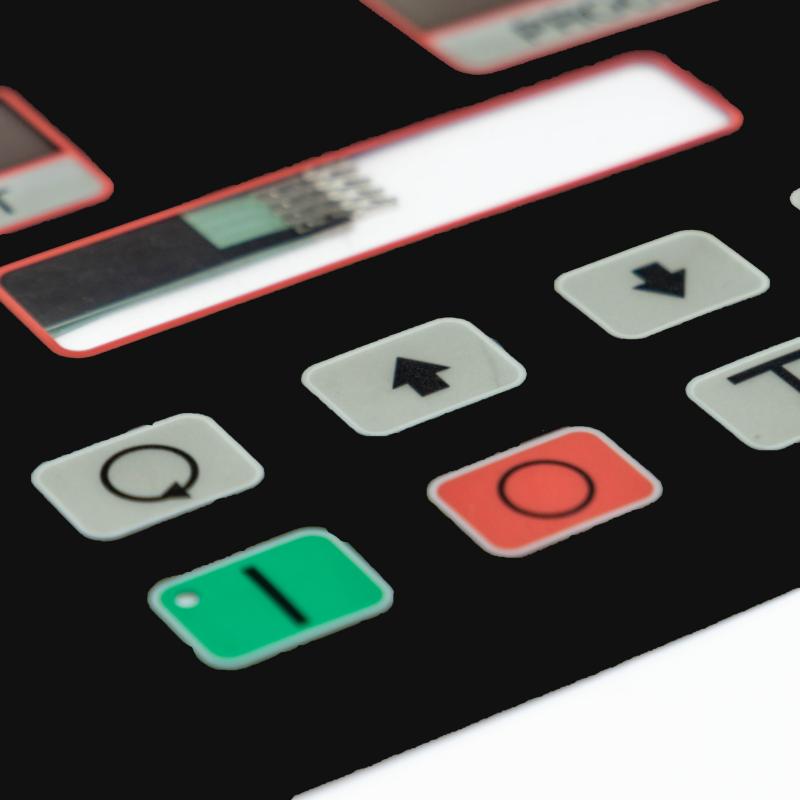
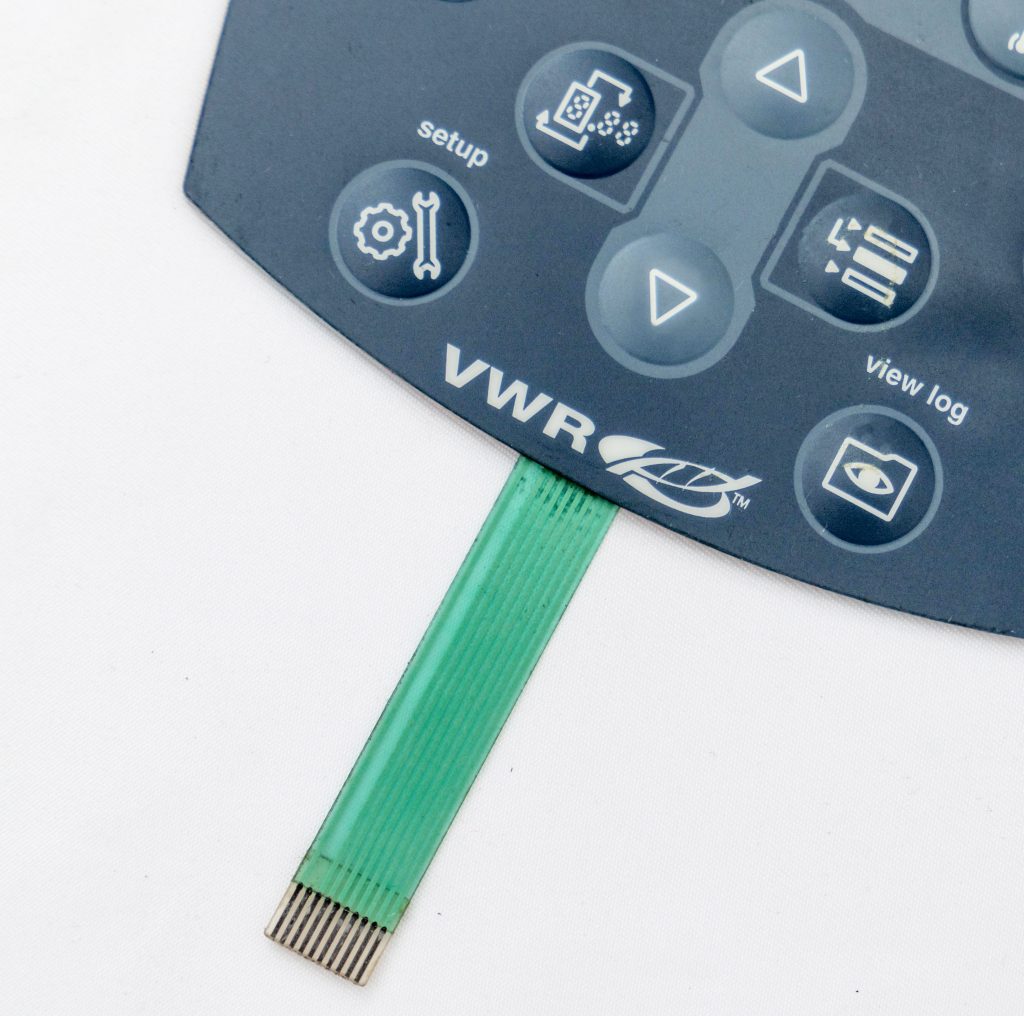
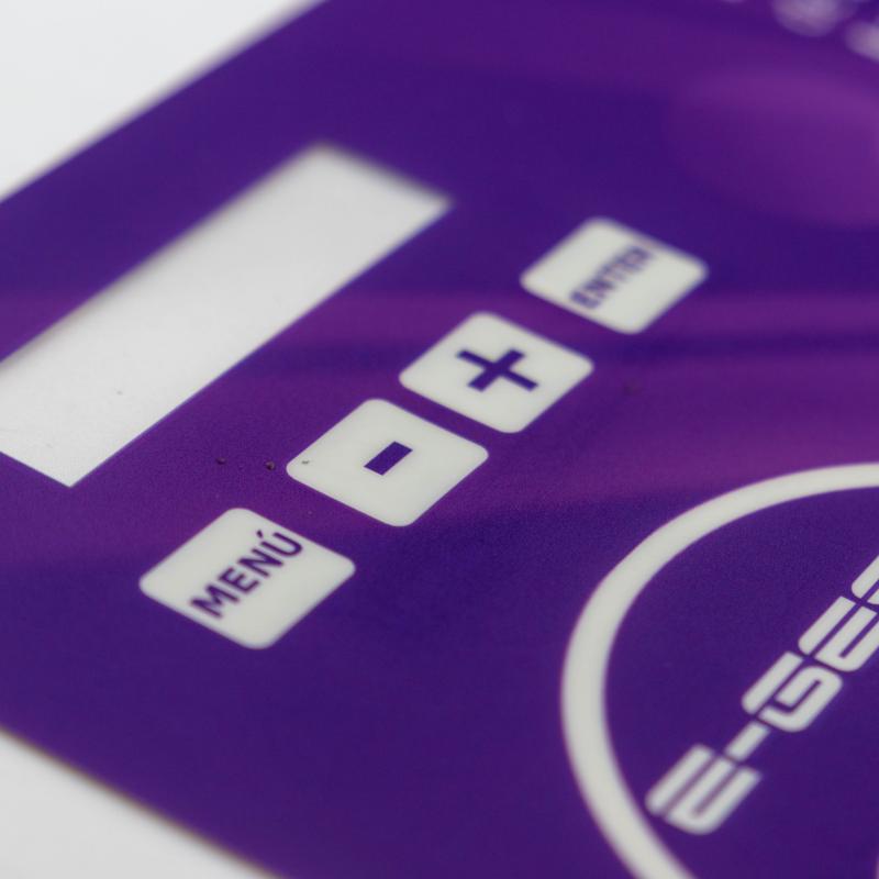
Graphic overlays are an essential component in the design of many electronic devices, providing a visual interface for the user while also protecting the underlying components. One of the most critical aspects of creating a graphic overlay is color matching, as the color of the overlay can impact the overall look and feel of the device. In this article, we will discuss the key considerations for color matching in graphic overlays and provide a comprehensive guide for designers.
Before we dive into the specifics of color matching in graphic overlays, it’s essential to understand the basics of color theory. Color theory is the study of how colors interact and can be combined to create harmonious color schemes. There are several color models used in design, including RGB, CMYK, and Pantone.
RGB stands for red, green, and blue and is used for digital displays, such as computer monitors and televisions. RGB color values are expressed as a combination of three numbers, representing the intensity of each color.
CMYK stands for cyan, magenta, yellow, and black and is used for printing. CMYK color values are expressed as a percentage of each color, with 100% representing the full intensity of each color.
Pantone is a standardized color matching system used by designers and printers to ensure consistent color reproduction. Pantone colors are identified by a unique number and are available in both RGB and CMYK versions.
Once you have a basic understanding of color theory, the next step is to choose the right colors for your graphic overlay. There are several factors to consider when selecting colors, including the intended use of the device, the target audience, and the desired aesthetic.
When it comes to color matching, it’s essential to consider both the RGB and CMYK versions of your colors. RGB colors will appear differently on digital displays, such as computer monitors and televisions, compared to how they will appear in print. CMYK colors will also appear differently on different printing processes and materials.
To ensure consistent color reproduction, it’s essential to use a standardized color matching system, such as Pantone, and to calibrate your displays and printers to ensure accurate color representation.
Once you have selected your colors, the next step is to test them to ensure they meet your standards. This can be done by creating a color swatch book and comparing it to the final product. It’s essential to test colors on both digital displays and in print to ensure they match the desired shade.
It’s also critical to obtain approval from all stakeholders before proceeding with production. This includes getting approval from the client, as well as any internal stakeholders, such as marketing, sales, and engineering teams.
In conclusion, color matching is a critical aspect of creating a graphic overlay that is both functional and aesthetically pleasing. By understanding color theory, selecting the right colors, and testing and approving them, you can ensure that your graphic overlay meets your standards and provides an exceptional user experience.
Do you have any questions, or would you like to speak directly with a representative?