Contact
Write to Us And We Would Be Happy to Advise You.
Do you have any questions, or would you like to speak directly with a representative?
By hqt
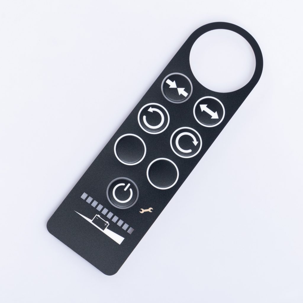
When it comes to creating a graphic overlay, one of the most important considerations is how it should feel. The feel of a graphic overlay can greatly impact the user experience and the overall impression of a product or interface. In this article, we will explore different factors to consider when determining how you want your graphic overlay to feel and provide valuable insights into achieving the perfect look. So, let’s dive in!
Defining the Purpose
Before diving into the design elements, it’s essential to understand the purpose of your graphic overlay. Are you aiming for a sleek and modern look, or do you want to evoke a sense of nostalgia? Is the overlay meant to convey professionalism or a playful vibe? By defining the purpose, you can effectively align the design elements with the desired feel.
The Power of Colors
Colors play a crucial role in setting the tone and feel of a graphic overlay. Each color carries its own emotional connotations and can evoke specific reactions from viewers. For example, warm colors like red and orange can create a sense of energy and excitement, while cooler tones like blue and green can elicit a calming effect. Consider your target audience and the emotions you want to evoke when selecting a color palette.
Typeface Matters
Typography is another significant factor in determining the feel of your graphic overlay. Different fonts and typefaces have their own personalities and can convey various messages. For instance, a bold and sans-serif font might be suitable for a modern and edgy feel, while a script font can add elegance and sophistication. Make sure to choose a typography style that aligns with your desired overlay feel and enhances readability.
Finding the Perfect Harmony
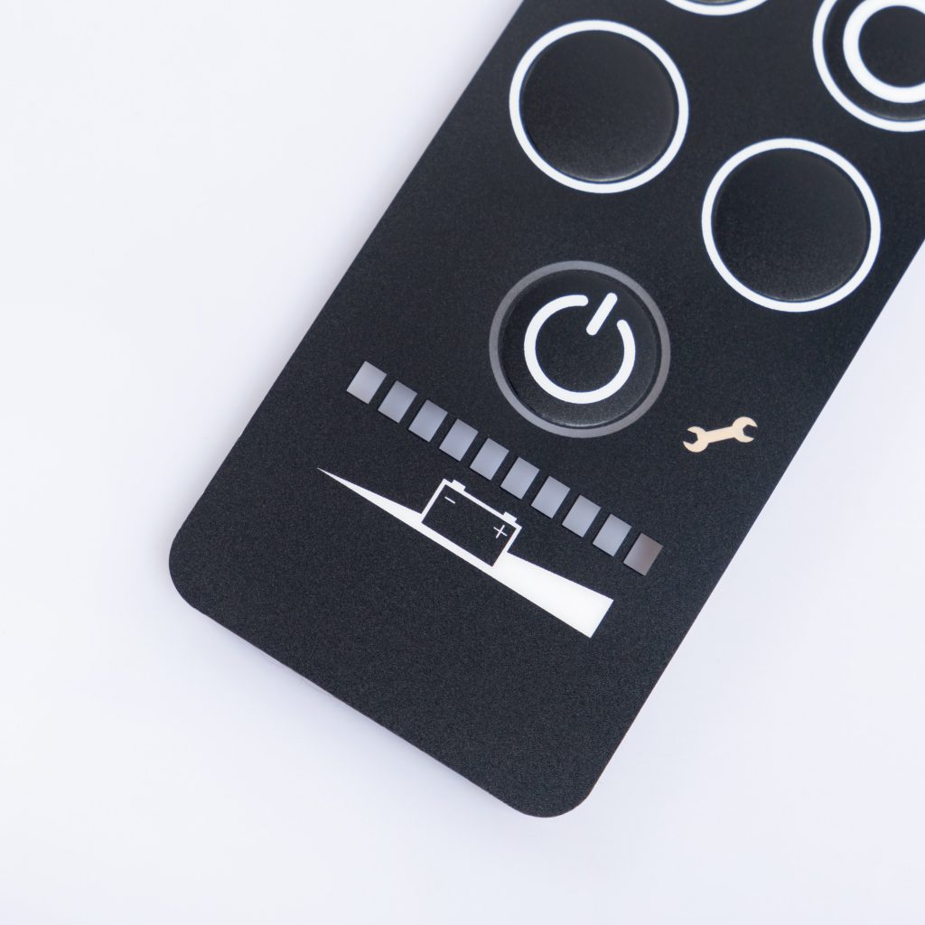
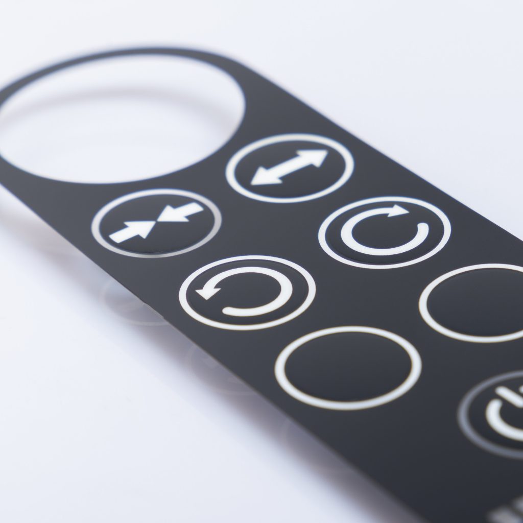
A graphic overlay involves a delicate balance between text and graphics. The placement, size, and visual hierarchy of these elements can greatly impact the overall feel of the overlay. Ensure that the text is legible and the graphics are clear and visually appealing. Finding the right balance will help you create a cohesive and harmonious design that communicates your desired feel effectively.
Designing for User-Friendliness
While aesthetics are crucial, it’s equally important to prioritize user experience. A graphic overlay should be intuitive and user-friendly, allowing users to navigate effortlessly and interact with the interface. Consider the placement of buttons, the ease of understanding instructions, and the overall flow of the overlay. By focusing on UX, you can ensure that the feel of your graphic overlay translates into a positive and seamless user experience.
The Power of Feedback
Once you’ve designed your graphic overlay, it’s essential to test it and gather feedback. Share prototypes with your target audience or conduct usability testing to evaluate the feel of the overlay. Pay attention to their reactions, suggestions, and pain points. This feedback will provide valuable insights for refining and improving your design, ensuring that the overlay feels just right.
Q1: How can I determine the feel of my graphic overlay?
A: To determine the feel of your graphic overlay, consider the purpose, choose an appropriate color palette, select typography that aligns with the desired feel, strike a balance between text and graphics, and prioritize user experience.
Q2: Can the feel of a graphic overlay impact user engagement?
A: Absolutely! The feel of a graphic overlay can significantly impact user engagement. A well-designed overlay that aligns with the desired feel can create a positive user experience, encouraging users to interact and engage with the interface.
Q3: Should I prioritize aesthetics or user experience when designing a graphic overlay?
A: Both aesthetics and user experience should be given equal importance when designing a graphic overlay. Striking a balance between the two will ensure that your overlay looks visually appealing while providing a seamless and user-friendly experience.
Q4: How can I gather feedback on my graphic overlay design?
A: You can gather feedback on your graphic overlay design by sharing prototypes with your target audience, conducting usability testing, or seeking input from design experts. Listening to feedback will help you refine and improve your design.
Q5: Are there any tools available to help create graphic overlays?
A: Yes, there are several tools available that can assist you in creating graphic overlays. Some popular options include Adobe Photoshop, Illustrator, Canva, and Figma. These tools offer a wide range of features and functionalities to bring your design ideas to life.
Q6: What are the key elements of a user-friendly graphic overlay?
A: A user-friendly graphic overlay should have clear and legible text, visually appealing graphics, intuitive navigation, and a logical flow. By considering these elements, you can ensure that users can easily interact with the overlay.
In conclusion, determining how you want your graphic overlay to feel is a crucial step in the design process. By considering the purpose, selecting an appropriate color palette and typography, striking the right balance between text and graphics, prioritizing user experience, and gathering feedback, you can create an overlay that effectively communicates the desired feel. Remember, it’s essential to test, refine, and iterate to achieve the perfect look for your graphic overlay.
Do you have any questions, or would you like to speak directly with a representative?